
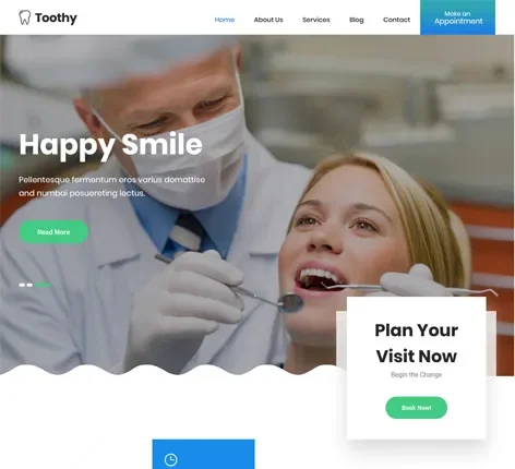
A dental website converts visitors into booked appointments when it removes friction at every step: a clear above-the-fold call to action, a booking process that takes seconds rather than minutes, visible trust signals placed exactly where a hesitant visitor needs reassurance, and a fast, mobile-first experience, since most dental searches now happen on a phone. Most dental websites convert only 2–5% of visitors into patients; practices that deliberately design around these principles commonly reach 8–12%.
Traffic without conversion is just a vanity metric. A dental practice can rank #1 for every keyword that matters and still lose patients to a competitor with a worse ranking but a website that actually makes booking easy. This guide covers the specific, evidence-backed elements of dental website design that separate a site functioning as a real patient-acquisition engine from one that’s quietly costing the practice appointments every single day.
Why Conversion Deserves as Much Attention as Rankings
If your website gets 1,000 visitors a month at a 2% conversion rate, that’s 20 new patient inquiries. Improve that rate to 5% with the same traffic, and you’ve more than doubled inquiries without spending another dollar on marketing to get there. Conversion optimization is the highest-leverage lever most dental practices aren’t actively pulling — it makes every other marketing dollar you spend, whether on SEO, Google Ads, or referrals, work harder without additional spend.
The First Few Seconds Decide Almost Everything
Roughly 80% of visitors never scroll past what’s visible when a page first loads — the “above the fold” area. That means your hero section carries a disproportionate share of the conversion burden. An effective dental homepage hero should, within seconds, make clear:
- Who you are — practice name and what kind of dentistry you focus on
- Where you are — enough to confirm the visitor is looking at a locally relevant practice
- What to do next — a single, unmistakable call to action
Cluttered hero sections, generic stock photography, or vague messaging lose visitors before they ever reach a treatment page, no matter how strong that page might be.
Calls to Action: Placement, Wording, and Size
- Use specific, action-oriented text. “Schedule Your Appointment” or “Book Online Now” consistently outperforms generic phrasing like “Learn More” or “Submit.”
- Repeat the primary CTA at least three times per page — in the header, after key service information, and in the footer — rather than burying it in a single location.
- Make click-to-call genuinely functional on mobile, with the phone number large and tappable in the header on every page. Many patients, particularly older demographics or anyone with an urgent need, still prefer calling over filling out a form.
- Respect minimum tap-target sizing — at least 44×44 pixels — so mobile visitors aren’t fighting with a button too small to reliably tap.
- Keep the CTA within the visible viewport on both mobile and desktop, without requiring a scroll to find it.
Reduce Booking Friction Aggressively
The booking or contact step is where motivated visitors most often abandon if the process asks too much of them. A few concrete fixes consistently move the needle:
- Shorten booking forms to the essentials. Every additional field is an additional reason to abandon, particularly on mobile. Ask only for what you genuinely need to confirm an appointment; you can gather the rest during intake.
- Offer real online scheduling integrated with your practice management software, not just a contact form that generates a callback days later. Patients increasingly expect to see actual available times and confirm a slot immediately, even outside office hours.
- Confirm instantly via text or email so the patient feels the appointment is genuinely locked in, reducing the chance they keep browsing competitor sites afterward.
- Surface an emergency or same-day path prominently for urgent searches — this captures some of the highest-intent, fastest-converting traffic a dental site sees, and a visitor in genuine discomfort will bounce immediately if that path isn’t obvious.
Trust Signals: What to Show and Where
Dental anxiety affects a meaningful share of adults, and a website has to overcome that hesitation before a visitor will commit to booking. The trust signals that do this work most effectively include:
- Years in practice and long-term stability (“Serving [Community] Since [Year]”)
- Professional credentials and specialized training, stated plainly rather than buried in a bio page
- Insurance and financing information, removing a major, common source of hesitation immediately rather than forcing a visitor to call and ask
- Membership and accreditation badges (professional dental association membership, recognized quality accreditations)
- Real photography — the actual team, actual office interior — rather than generic stock imagery, which experienced visitors recognize instantly and which quietly undermines authenticity
Placement matters as much as the signals themselves. Put trust elements in the homepage hero, consistently in the footer, on the appointment booking page for a final reassurance right before commitment, and specifically on any “new patient” page addressing common first-visit anxieties.
Visit more: How to Choose the Best SEO Company for Dentists in 2026 (Checklist)
Give Every Treatment Its Own Page
A single, generic “Services” page listing every treatment in a bullet list cannot do the persuasive or informational work an individual treatment page can. Each significant treatment — implants, Invisalign, teeth whitening, emergency care — deserves a dedicated page that explains the procedure clearly, addresses cost and process honestly, and provides a natural, specific point of conversion. This also captures far more high-intent search traffic than a single catch-all page ever could, since patients search for specific treatments, not a generic word like “services.”
Social Proof: Reviews and Before/After Content
Embed genuine Google reviews directly on the homepage and relevant service pages — not tucked away on a separate testimonials page few visitors ever find. Reviews function as social proof exactly at the moment a visitor is deciding whether to trust your practice, so placing them near booking decision points (rather than isolating them elsewhere) measurably lifts conversion.
Before-and-after treatment photos, where clinically and legally appropriate and with proper patient consent, are particularly persuasive for cosmetic and restorative treatments specifically, since they let a hesitant visitor see realistic outcomes rather than take marketing copy on faith.
Mobile-First Isn’t Optional
The majority of dental website traffic arrives on mobile, and search behavior increasingly happens between meetings, in a carpool line, or late at night in bed — moments where patience for a clunky experience is close to zero. A genuinely mobile-first dental site means:
- Design for mobile first, then scale up to desktop — not the reverse, which is still how many older or poorly maintained dental sites are structured
- Sub-3-second load times, since every additional second of load time measurably increases abandonment
- Simplified mobile navigation — no more than roughly five main menu items, avoiding the temptation to cram every service into the primary nav
- Booking achievable in a small number of taps, without pinch-zooming or horizontal scrolling to interact with forms or buttons
Test this yourself, regularly: pull out an actual phone and try to book an appointment on your own site. If it takes more than a few taps or requires zooming, real patients are abandoning at that exact point today.
Page Speed Is a Conversion Feature, Not Just a Technical One
Every additional second of load time increases the share of visitors who leave before the page even finishes rendering — which means slow speed doesn’t just hurt SEO rankings, it directly wastes whatever budget you spent driving that visitor to the site in the first place. Core Web Vitals thresholds worth treating as a baseline, not an aspirational target: Largest Contentful Paint under 2.5 seconds, Interaction to Next Paint under 200 milliseconds, and Cumulative Layout Shift under 0.1.
Structure Content So AI Search Can Use It Too
Increasingly, patients search in full questions rather than short keyword fragments — “how much do dental implants cost,” “is Invisalign painful” — both directly on Google and through AI tools like ChatGPT. Structuring key pages with clear, question-style headings that answer these queries directly serves two audiences at once: patients scanning for a fast answer, and AI systems extracting content to build a generated response. A genuinely helpful, well-organized blog answering real patient questions also gives your practice a reason to be cited in AI-generated answers, not just found through traditional search.
Compliance and Security Signals Matter More Than You’d Expect
An expired SSL certificate, showing “Not Secure” in a visitor’s browser bar, will quietly cost you patients who’d otherwise book — even if they can’t articulate exactly why they left. HIPAA-compliant forms for any page collecting patient information aren’t just a legal requirement; they’re part of the trust equation for a category where patients are handing over sensitive personal information before they’ve even met you in person.
What a Conversion-Focused Redesign Typically Costs
Redesign investment in 2026 generally falls into a few tiers: basic DIY website builder templates run relatively low but lack real practice-management integration and SEO structure; general-purpose design agencies typically charge more but may lack dental-specific conversion expertise; and dental-specific platforms tend to sit in between, with booking, compliance, and speed optimization built in from the start rather than bolted on afterward. Whichever route you choose, prioritize a partner who can show conversion data from actual dental clients, not just attractive design portfolios — a beautiful site that doesn’t convert is still an underperforming asset.
How to Test and Improve Conversion Over Time
Conversion optimization isn’t a one-time project — it’s an ongoing discipline. A/B test one element at a time (a CTA button’s color or wording, a form’s field count, a hero section’s layout), and give each test enough traffic and time to produce a statistically meaningful result rather than reacting to a handful of visits. Track the metrics that actually matter: new patient bookings by traffic source, conversion rate by individual page (not just site-wide), and where in the booking flow visitors are dropping off. If you can’t tie a specific booking back to a specific channel and page, you’re optimizing blind.
Frequently Asked Questions
What’s the average conversion rate for a dental website?
Most dental websites convert between 2% and 5% of visitors into appointment inquiries, while practices that deliberately optimize for conversion — strong CTAs, reduced booking friction, visible trust signals — commonly reach 8–12%.
What’s the single most important dental website design element for conversions?
Reducing friction in the booking process — short forms, real online scheduling, and a consistently visible call to action — tends to produce the fastest, most measurable conversion improvements of any single change.
Does page speed really affect whether patients book?
Yes — every additional second of load time measurably increases the share of visitors who abandon the page, meaning slow speed directly costs bookings independent of its separate impact on search rankings.
Should every dental treatment have its own page?
Yes. A single generic services page cannot capture the specific search intent or answer the specific questions each treatment raises — dedicated pages for major treatments consistently convert better and capture more search traffic.
How much does a dental website redesign cost?
Costs vary by approach, generally ranging from a few thousand dollars for a template-based DIY build to tens of thousands for a fully custom, dental-specific platform with integrated booking, compliance, and speed optimization built in.
Final Thoughts
A dental website’s job isn’t to look impressive — it’s to turn a nervous, comparison-shopping visitor into a booked patient with as little friction as possible. Prioritize a clear above-the-fold value proposition, aggressive booking-friction reduction, trust signals placed exactly where hesitation peaks, and genuine mobile-first speed, and the same traffic your SEO and marketing efforts already generate will convert at a meaningfully higher rate — no additional ad spend required.
Visit More: Dental SEO Cost Guide 2026: Pricing & What’s Included